Dylan Matthews, “40 charts that explain the world,” The Washington Post, 15 January 2014
… So we searched for charts that would tell not just the story of how the world is — but where it’s going. Some of these charts are optimistic, like the ones showing huge gains in life expectancy in poorer nations. Some are more worryisome — wait till you see the one on endangered species. But together they tell a story of a world that’s changing faster than at arguably any other time in human history.
1. Global inequality dwarfs anything we see in America.

Source: Branko Milanovic.
2. But the world wasn’t always so unequal.
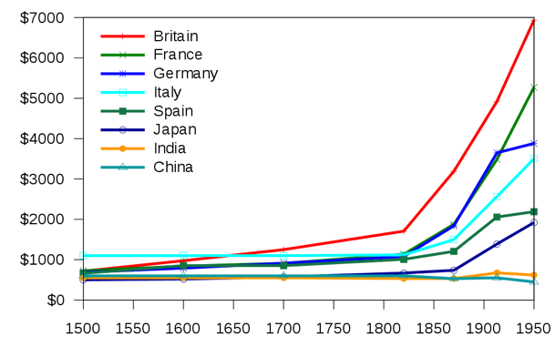
Source :Angus Maddison; chart by Kanguole
3. The richest people in poor countries are poorer than the poor of rich countries.
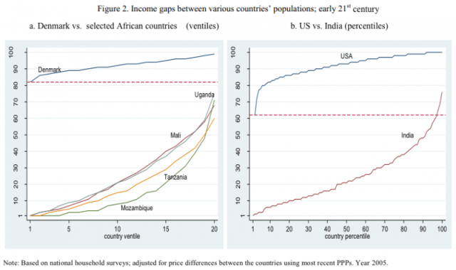
Source: Branko Milanovic.
4. Residents of poor countries could make many multiples of their salaries if they moved to rich ones.

Source: Clemens, Montenegro, and Pritchett, with additional calculations by Clemens, 2014.
5. This kind of poverty causes bad health and early deaths.
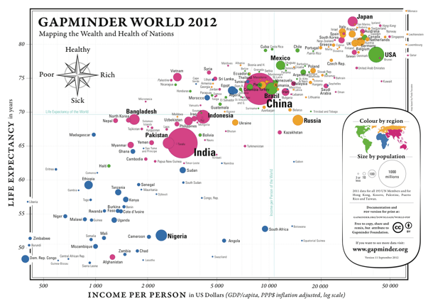
Source: Gapminder.
6. We are making progress, though, against global poverty.

If curent patterns persist, the global poverty rate (defined as the percentage of people who make under $1.25 a day) is set to fall from 22.4 percent in 2008 to 5.4 percent in 2030. If it speeds up, we could even see extreme poverty like this eliminated.
7. And we’re extending lifespans too.

Source: WHO.
8. Now, the way that people in rich countries die…

Source: Jones, Podolsky, and Greene.
9. …looks very different from the way people in general die.

Source: Thomas Porostocky.
10. Literacy has also grown as countries get richer.
11. Much of recent economic progress in the world has happened in China and India.

Source: Martin Ravallion.
12. Leaving most of the remaining poor in sub-Saharan Africa.
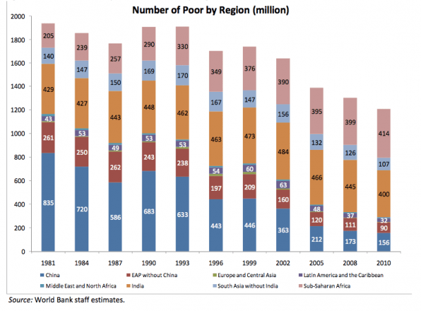
Source: World Bank.
13. Meanwhile, we’re not killing as many people in wars as we used to.
14. The wars we do fight tend to be within, rather than between, countries.
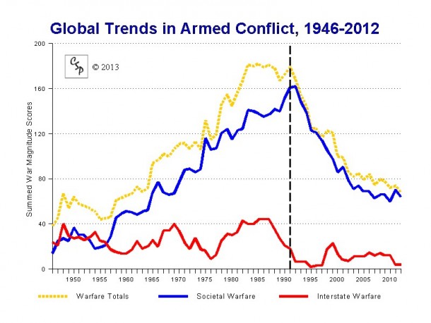
Source: Center for Systemic Peace.
15. Homicide is down across the board too.
16. If you’re a man, your odds of being killed in war have never been lower.
17. It’s not all roses, of course. Greenhouse gases are making the world hotter than ever.

Source: World Meteorological Organization.
18. Leading glaciers to melt and sea levels to rise.
19. Good ‘ol fashioned smog is on the rise, too, as China and India industrialize.

Source: OECD.
20. And acid rain’s making a comeback for the same reason.
21. Deforestation is continuing apace.
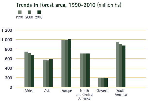
Source: FAO.
22. But we’re emitting fewer ozone depleting gases.
23. Our endangered species problem, however, is getting worse.
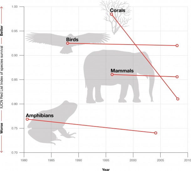
Source: IUCN.
24. Here in the U.S., our eating habits have changed considerably since the ’50s.

Source: Planet Money.
26. The global economic convergence is causing a lot of changes in already rich countries. Inequality is growing…

Source: OECD.
27. …and the share of income going to workers is declining.
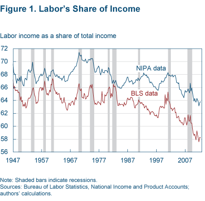
Source: Cleveland Fed.
28. That said, most rich countries have never had as much leisure time as they have now, as demonstrated by the recent decline in hours worked.
29. They also enjoy the fruits of Moore’s law in ever-cheaper electronics.
30. Worldwide, access to the Internet is growing considerably.
31. Global coal demand is rising.
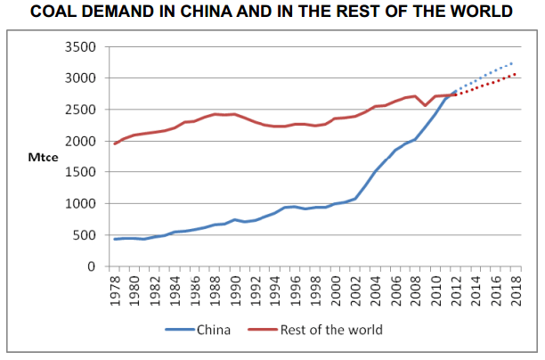
Source: International Energy Agency.
32. But it’s true, natural gas is booming, particularly compared to oil.
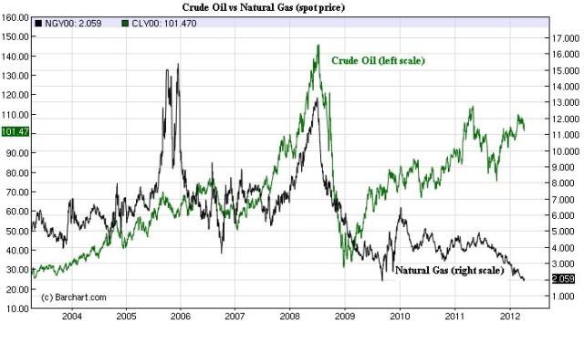
Source: Vaclav Smil.
33. Rich countries in general are spending more on health care — but none as much as the U.S.

Source: OECD.
34. The world’s still mostly Muslim and Christian.
35. But Islam and unaffiliated are growing in ranks.
36. The gap between men’s and women’s participation in the workforce is shrinking.
37. Though huge gaps in pay persist.
38. The center of the entertainment business is going eastward.
39. And despite the rise of Internet piracy, the entertainment sector is doing okay.
40. Nuclear weapons are decreasing in numbers, but more countries than ever have them.
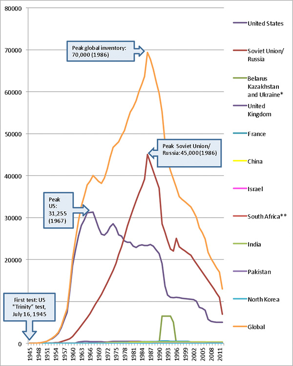
Source: Center for Arms Control and Non-Proliferation.
Read the full article here.
