Dylan Matthews, “Defense spending in the U.S., in four charts,” The Washington Post, 28 August 2012

Source: Center for Strategic and Budgetary Assessments
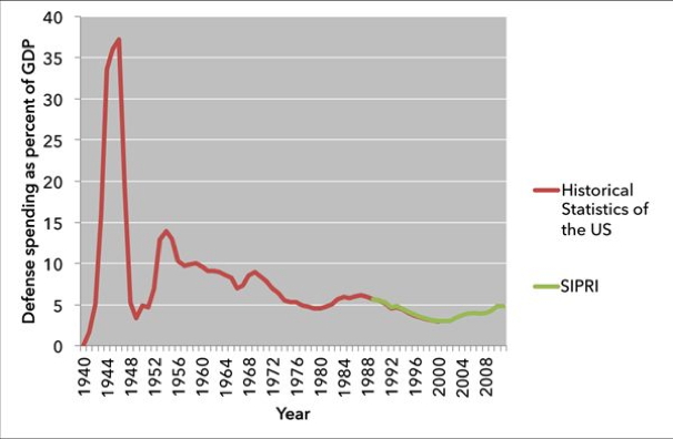
Here’s Eric Rauchway’s chart on that metric, using both the Historical Statistics of the United States, a database published by the University of Cambridge, and more recent military expenditure data from the Stockholm International Peace Research Institute:
Military spending shouldn’t increase in proportion to the economy that can fund the military, it should increase in proportion to the size of the population it’s meant to protect. That’s Wonkbooker Evan Soltas’ argument. He produced this chart of GDP spending per capita

The measure of inflation they use is for the economy generally. But maybe the cost of tanks and bombers has grown faster than the cost of bread and gasoline. If that’s true, using standard inflation figures may look like we’re spending more on defense than we really are.
Thankfully, the DOD issues inflation numbers (pdf) for defense spending from 1970 to the present. It turns out that defense inflation is a little greater than normal inflation. Defense prices have risen by about 553 percent since 1970, whereas the consumer price index, the most common inflation measure, only grew by about 487 percent. But they’re not actually that different:

Read the full articles here.
